Diagnotes Usability Study
Solution Snapshot
Conducted a two-phase usability evaluation of the Diagnotes healthcare communication platform. The study identified navigation issues, low feature awareness, and workflow barriers. Findings led to targeted design recommendations and training improvements that increased usability and supported better adoption.
Impact Summary
Revealed critical usability challenges, improved messaging workflows, increased feature awareness, and raised the SUS score from 53.3 to 67.5. The findings informed Diagnotes’ roadmap and guided future UX improvements.
Role
UX Research Analyst
Team
Emily Mueller, Tommy Starks, Wayne Smith, Andy Deddens, Clint Krotzer
Client
Diagnotes, Inc. (Academic Partnership)
Timeline
6 Weeks
Tools
Miro, Zoom, Survey Tools
Project Overview
Diagnotes is a HIPAA-compliant communication app used across IU Health. Our team performed a structured, two-phase study to evaluate usability, uncover workflow issues, and identify opportunities to improve feature discoverability and user satisfaction.
Client Background
The platform replaces traditional paging systems with secure messaging and team collaboration tools. It is widely used at Riley Hospital for Children, where frustrations with message workflows and navigation triggered the need for deeper usability evaluation.
Study Objectives
- Evaluate the usability of the Diagnotes mobile experience
- Identify high-value and underutilized features
- Surface workflow barriers through direct observation and survey data
- Provide actionable recommendations for design and training improvements
Methodology
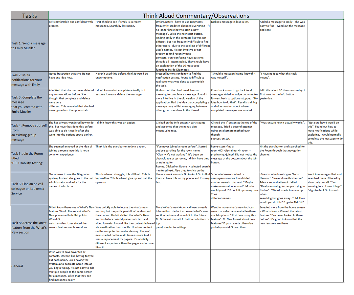
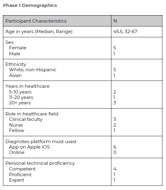
Phase 1: Qualitative Research
- 6 moderated usability sessions using think-aloud protocol
- Captured task success, error patterns, mental models, and pain points
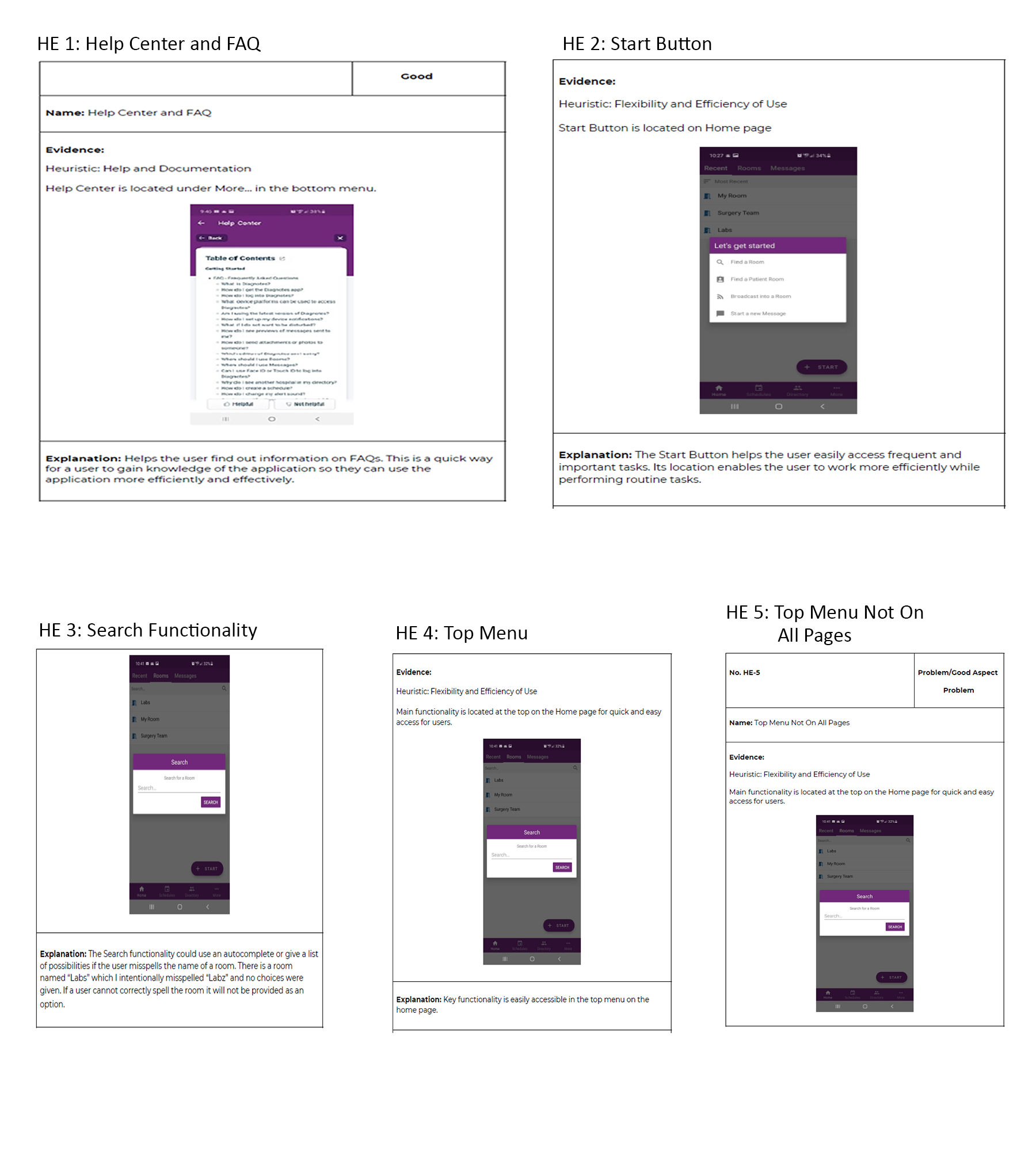
- Heuristic evaluation using Nielsen’s 10 Usability Heuristics
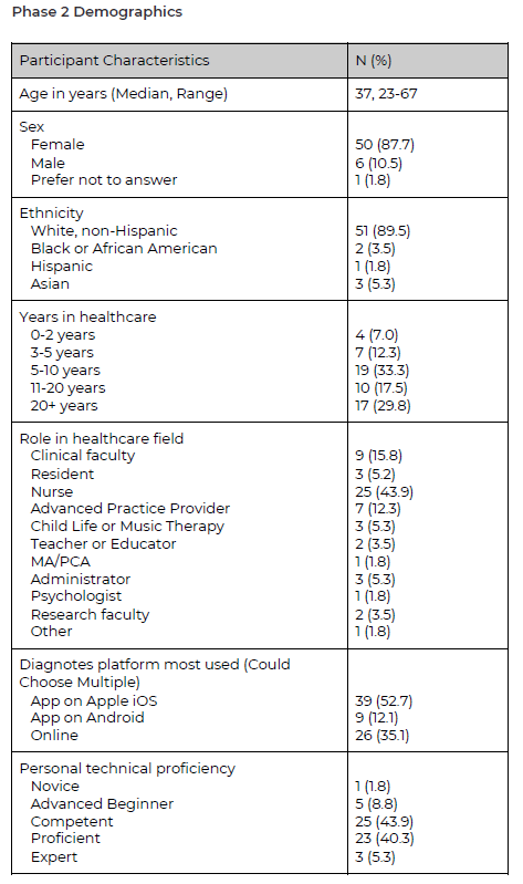
Phase 2: Quantitative Survey
- Survey distributed to 100+ healthcare professionals
- 57 responses collected in 36 hours
- Measured feature awareness and SUS usability scores
and group tools.
Key Findings
Usability Challenges
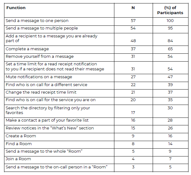
- Low discovery of advanced features like Rooms
- Inconsistent navigation patterns
- Users relied on external tools due to trust issues with schedules
- Message completion icon caused confusion and task failure
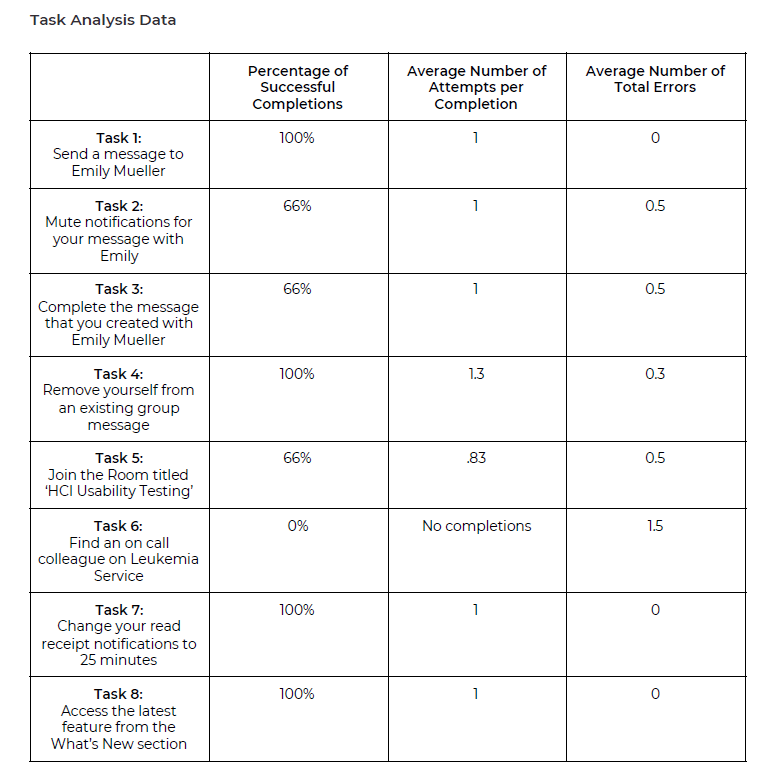
SUS Results
- Phase 1 SUS: 53.3
- Phase 2 SUS: 67.5
Design Recommendations
Increase Feature Awareness
- Short in-person walkthroughs
- Assign feature champions for hands-on help
- Create micro-training videos for Rooms and message completion
Simplify Message Completion
- Use familiar mobile patterns like swipe to complete
- Add text labels to critical icons
Strengthen Navigation Patterns
- Make navigation bars consistent across screens
- Replace logo-based nav with a standard hamburger menu
Improve Room Search
- Add auto-complete and recommended Rooms
Strengthen Schedule Reliability
- Clarify provider shifts and role designations
- Cross-check schedules with supporting systems
Key Takeaways
This project strengthened my ability to conduct full-cycle usability research and turn complex findings into actionable improvements. It highlighted the importance of pairing UX improvements with effective onboarding and training in high-stakes clinical environments.
Future Opportunities
Expanding this usability study across more hospitals and clinical roles would reveal broader workflow patterns and offer deeper insight into long-term opportunities for communication improvements.