Error Messages Redesign
Solution Snapshot
Redesigned the ACD system messaging framework, including both save confirmations and error alerts, to improve clarity, hierarchy, and user guidance. The updated messaging system introduced plain-language explanations and actionable recovery steps, helping users quickly understand system feedback and resolve issues without external support.
Outcomes
- Simplified and standardized system message formatting
- Improved accessibility and readability across the platform
- Reduced user confusion around system state and save confirmations
- Enabled users to resolve common errors without contacting support
Role
Product Analyst
Organization
American College of Cardiology Accreditation Services
Timeline
6 weeks (audit, copywriting, prototyping, stakeholder review)
Tools
Adobe XD
My Role & Responsibilities
- Audited existing system messages across the ACD platform
- Analyzed support tickets related to system errors and save confirmations
- Developed a standardized messaging framework for system feedback
- Wrote updated message copy using plain-language guidelines
- Collaborated with engineering to ensure messages accurately reflected system behavior
Background
The Accreditation Conformance Database (ACD) supports healthcare organizations in tracking patient data and quality metrics.
Because users regularly enter and manage critical clinical information, clear system feedback is essential. Users need to know when actions succeed, when errors occur, and how to recover from issues without disrupting their workflow.
However, the existing system messages lacked visual hierarchy and actionable guidance.
Problem
System messages across the ACD platform were difficult to read and often lacked context about what had occurred or how users should proceed.
Save confirmations were easy to miss, while error messages frequently failed to explain the issue or provide clear next steps.
As a result, users often questioned whether their actions had succeeded and frequently contacted support for clarification.
Before vs After
Legacy Experience
Original ACD System Messages
System messages used small text, minimal spacing, and inconsistent formatting, making them difficult to scan and interpret.
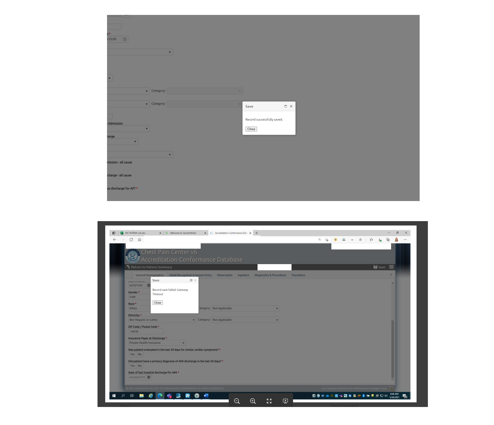
- Minimal visual hierarchy
- No clear distinction between success and error states
- Limited explanation of what caused the error
- No guidance for resolving issues
Redesigned Experience
Updated Error Message Framework
The redesigned system introduced structured messaging with clear headlines, supporting context, and actionable next steps.
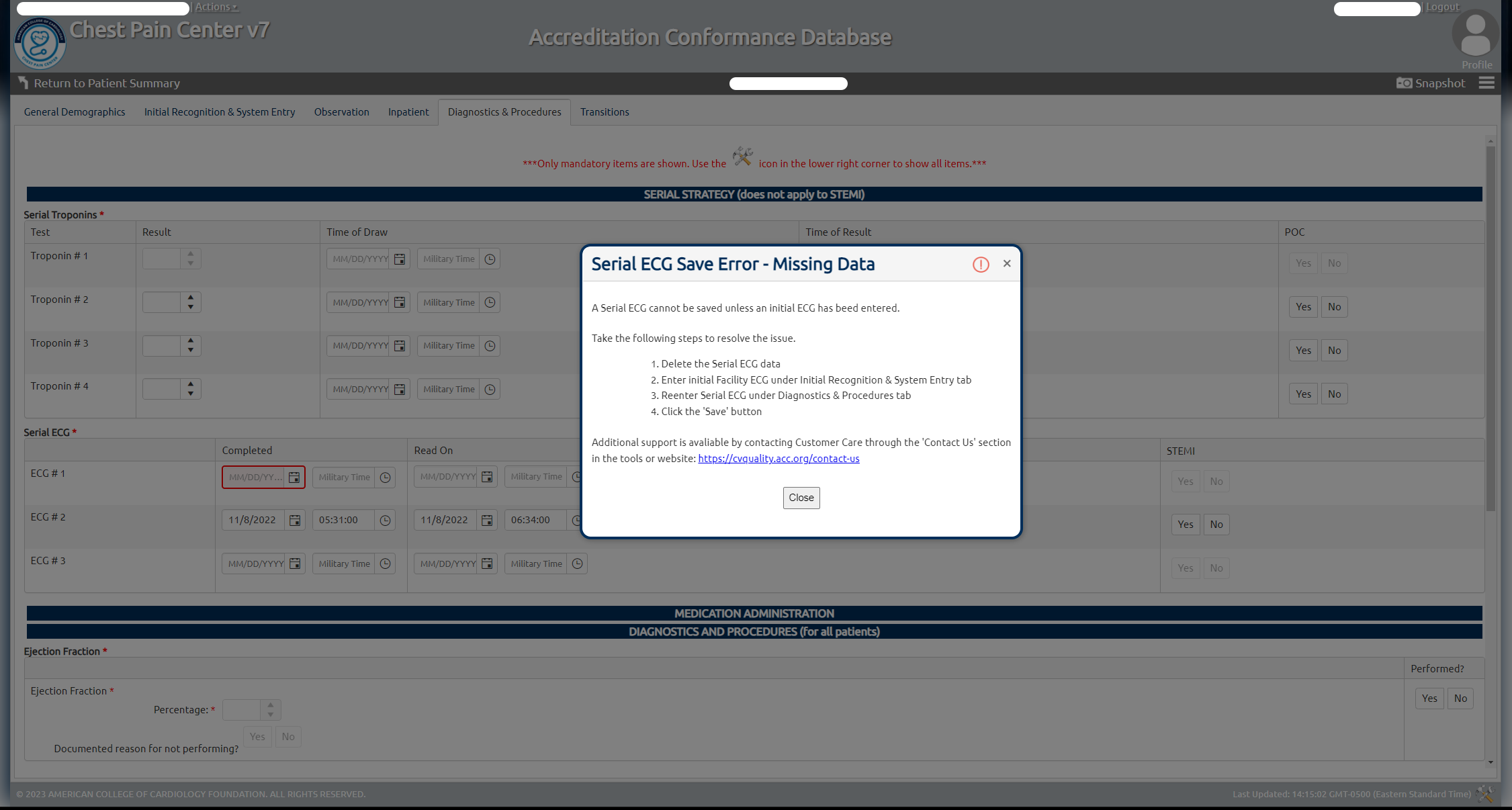
- Improved message hierarchy and readability
- Clear distinction between success and error states
- Plain-language explanations of system behavior
- Guidance for resolving common issues
Solution
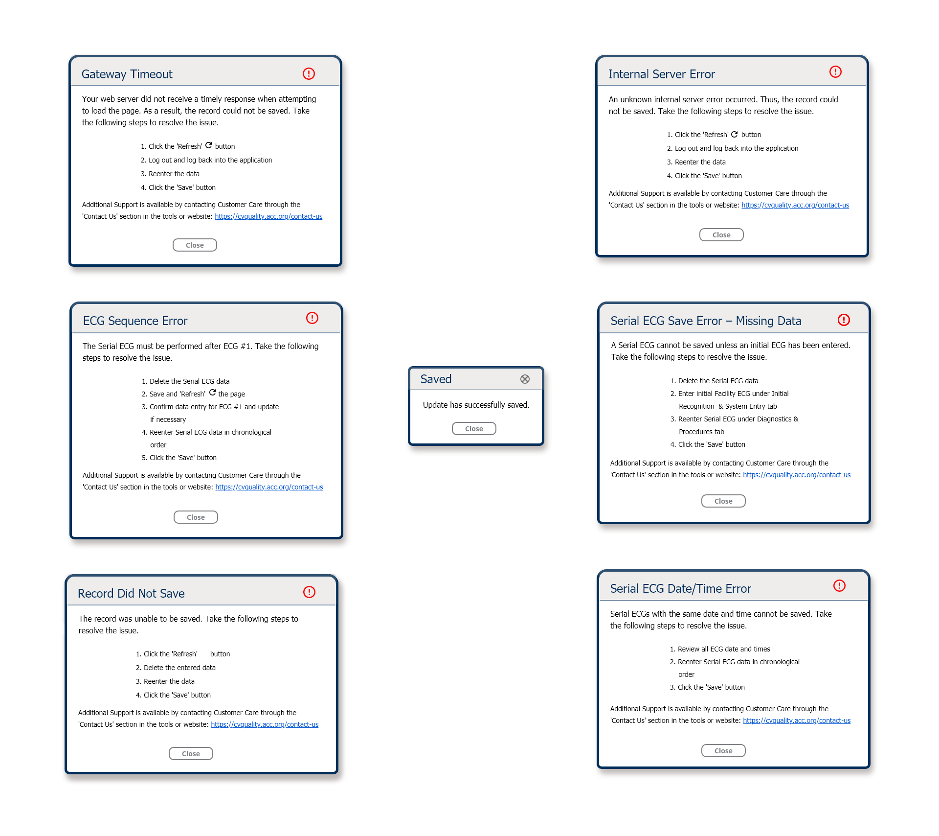
The redesigned messaging framework standardized how the system communicates both success and error states.
Each message now includes:
- Clear headline describing the system state
- Plain-language explanation of what occurred
- Actionable guidance for resolving issues
- Optional support contact when necessary
This structure ensures users understand both what happened and what to do next.
Results
User Experience Improvements
- Improved clarity and readability of system feedback
- Reduced user uncertainty around save confirmations
- Enabled faster recovery from common errors
Business Impact
- Reduced support requests related to system messaging
- Improved user confidence in platform reliability
- Created a standardized framework for future messaging updates
Skills Demonstrated
- UX writing and system messaging design
- Improving usability through clearer system feedback
- Accessibility and readability improvements
- Cross-functional collaboration with engineering
- Designing scalable UI messaging frameworks