EHAC Course Registration Redesign
Solution Snapshot
Redesigned a fragmented course registration experience by consolidating three separate sign-up flows into a single adaptive form. The new workflow introduced validation and conditional UI logic to guide users through the correct registration path based on course type, reducing user errors and improving the quality of reporting data.
Outcomes
- Reduced incomplete and invalid registrations through validation and conditional form logic
- Simplified the registration workflow by eliminating redundant fields
- Improved accuracy of hospital and location reporting data
Role
Product Analyst
Organization
American College of Cardiology Accreditation Services
Timeline
6 weeks (analysis, workflow redesign, and implementation support)
Tools
Adobe XD, JavaScript, Requirements documentation
My Role & Responsibilities
- Analyzed registration reports to identify patterns of incomplete or invalid data
- Partnered with business stakeholders to define reporting requirements
- Redesigned the registration workflow and dynamic form behavior
- Documented conditional logic and acceptance criteria for engineering
- Supported QA and validation testing prior to release
Background
The EHAC program provides online emergency preparedness courses for both community members and hospital employees.
Historically, the registration process existed across three separate pages:
- Community registration
- Employee registration
- Spanish registration
Each flow collected similar information but used different structures. The forms lacked validation and conditional behavior, which frequently resulted in missing or inaccurate data.
Because EHAC registrations feed directly into internal reporting and auditing processes, unreliable data created downstream operational challenges for the program team.
Problem
The fragmented registration experience produced inconsistent and unreliable reporting data.
Multiple registration flows created confusion for users, while the lack of validation allowed incomplete or incorrect submissions. Hospital information was often manually entered and inaccurate, which reduced confidence in the reporting data used to track program participation.
Improving the reliability of registration data became both a user experience issue and a business operations priority.
Before vs After
Legacy Experience
Legacy Community Registration Page
One of three separate registration flows with no validation or conditional behavior, which contributed to missing names and inaccurate hospital data.
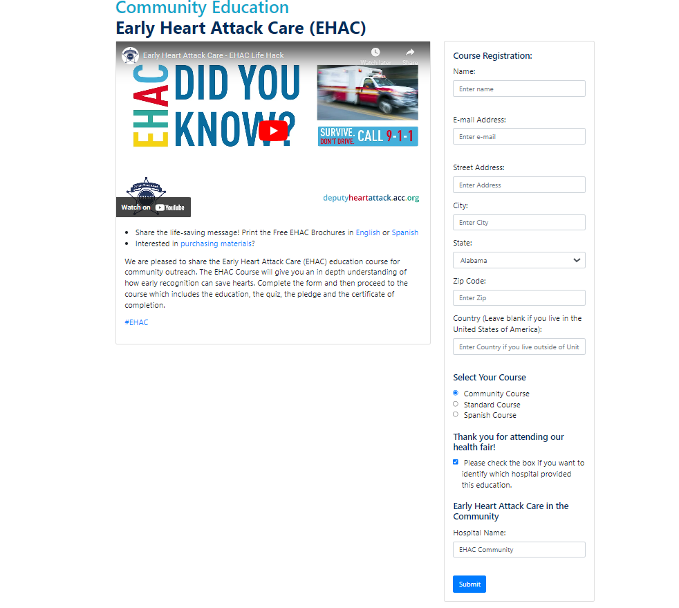
- Three separate registration pages (Community, Employee, Spanish)
- No validation or required-field enforcement
- Manual hospital entry leading to inaccurate data
- Inconsistent reporting across course types
Redesigned Experience
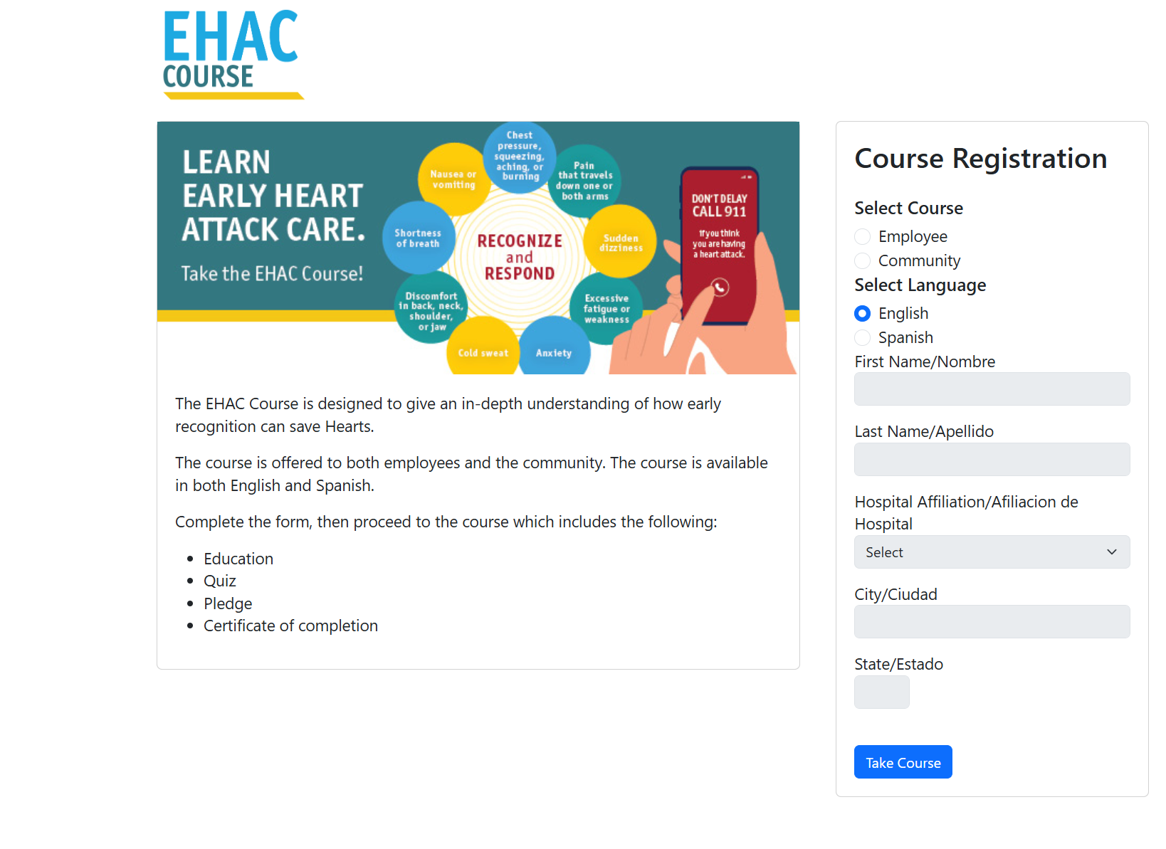
Unified Registration Form
Single adaptive form supporting Community, Employee, and Spanish registrations with conditional logic and structured data entry.
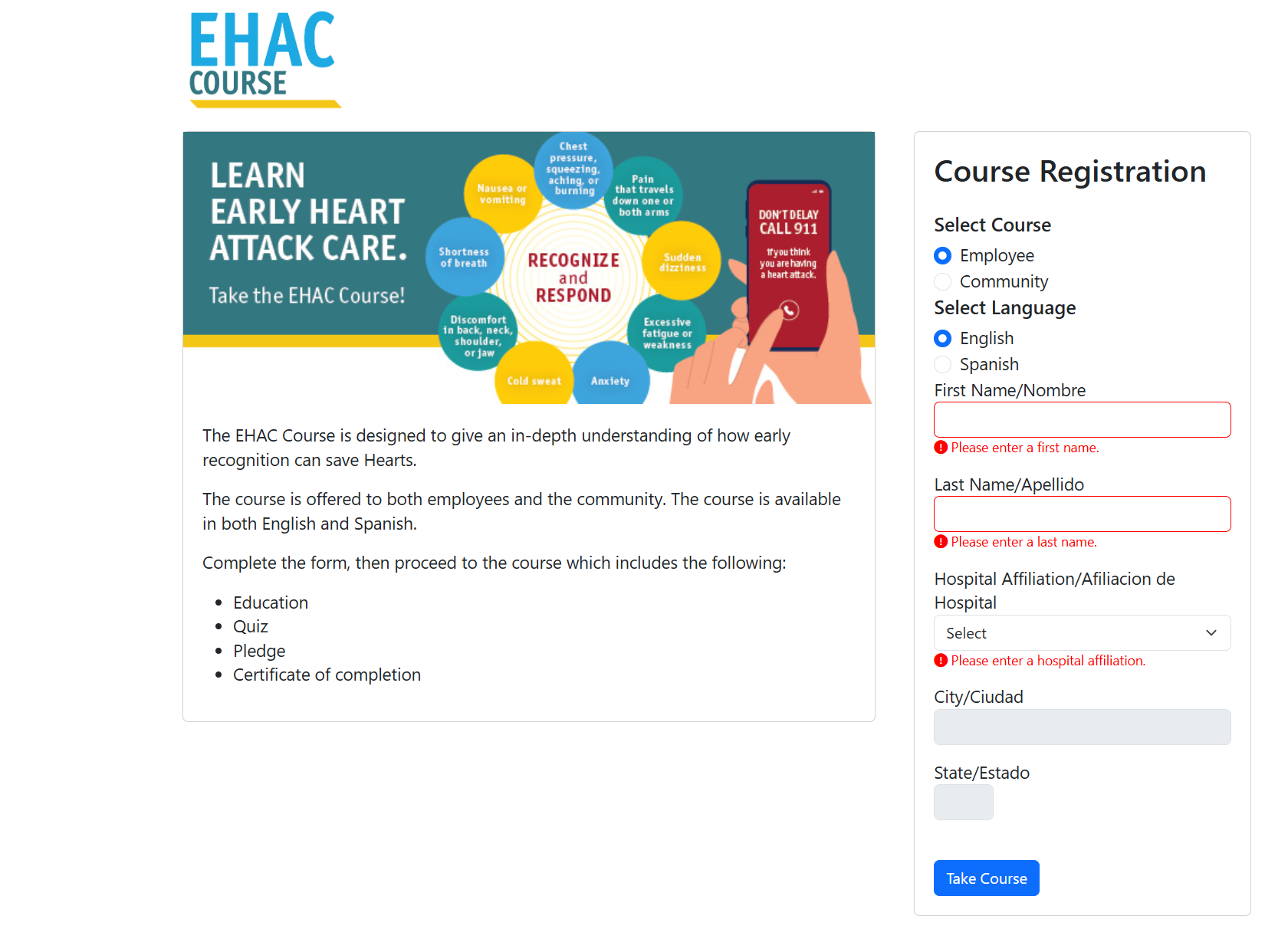
Inline Validation Example
Required-field validation prevents incomplete submissions and guides users to correct missing information.
- Single adaptive registration form
- Conditional UI logic based on course type
- Structured hospital selection with auto-populated location data
- Inline validation preventing incomplete submissions
Goals
Product Goals
- Consolidate three registration flows into a single unified experience
- Reduce user errors through validation and conditional logic
- Improve the quality of registration data used for reporting
- Simplify the overall registration workflow for users
Discovery
Legacy Flow & Data Review
I reviewed both the legacy registration pages and the data generated from course reports. This analysis revealed recurring issues:
- Missing first and last names
- Incorrect hospital entries
- Users selecting the wrong course type
- Unnecessary fields increasing friction
Stakeholder discussions helped determine which data points were actually required for reporting and auditing.
Key Insights
Several patterns emerged from the analysis:
- Maintaining three separate flows created unnecessary complexity
- Lack of validation was the primary cause of poor data quality
- Some collected fields had little value for reporting
- Hospital selection should determine city and state values
- Conditional UI logic could prevent invalid combinations
Constraints & Tradeoffs
The redesign needed to balance usability improvements with operational requirements.
Certain fields were required for reporting and auditing, which limited how much the form could be simplified. Additionally, engineering constraints meant that most conditional behavior would be implemented through front-end JavaScript rather than backend logic.
Because of these constraints, the solution focused on using dynamic UI behavior and validation rules to guide users through the correct registration path while still capturing the required reporting data.
Solution
Unified Registration Form
The redesign replaced the three legacy pages with a single adaptive registration form.
Users now select their course type first, and the interface dynamically adjusts to display only the relevant fields for that path.
Field Simplification
Several fields were removed because they did not contribute meaningful reporting value:
- Email address
- Zip code
- Country
- "Identify your hospital" checkbox
Removing these fields reduced form complexity while preserving the data required for reporting.
Dynamic Form Logic
JavaScript-based conditional logic controls how the form behaves.
- Employee registrations: require first name, last name, and hospital
- Hospital selection: automatically populates city and state
- Community registrations: hospital and location fields are disabled
- Validation: inline error messages prevent incomplete submissions
This approach ensured users could only submit valid and complete registration data.
Microcopy Improvements
The primary action button was updated from “Submit” to “Take Course.”
This clarified the action for users and aligned the interface with their goal of beginning the course.
Results
Data Improvements
- Reduced incomplete and inaccurate registration records
- Improved hospital and location accuracy through structured selection
- Consolidated reporting into a single dataset
User Experience Improvements
- Simplified one-page registration workflow
- Reduced cognitive load by enabling only relevant fields
- Clearer separation between Community and Employee registration paths
Business Impact
- More reliable reporting data for the EHAC program
- Reduced manual data cleanup by staff
- Greater confidence in program performance metrics
Future Opportunities
Potential enhancements include:
- Implementing type-ahead hospital search
- Tracking form validation errors to measure usability improvements
- Expanding Spanish support where needed
- Integrating backend hospital verification
Skills Demonstrated
- Product and UX strategy under operational constraints
- Workflow and form redesign
- JavaScript-driven dynamic UI logic
- Cross-functional collaboration
- Requirements and acceptance criteria documentation
- Translating business needs into technical implementation