Kennedy Space Center IA Redesign
Goal
Redesign the Kennedy Space Center website’s information architecture to improve content findability, reduce navigation complexity, and support visitor journeys through a clearer, research-backed structure.
Outcome
The redesigned IA improved task success to 88%, reduced click depth for key actions, strengthened category clarity, and aligned the site structure with the mental models of families, educators, and space-enthusiast visitors.
Role
Product Analyst
Collaborated within a 4-person team, contributing to research synthesis, card sorting analysis, IA modeling, and validation through Treejack testing.
Course
Information Architecture – UC Berkeley Extension
Tools
Optimal Workshop (Treejack)
Skills
Card Sorting, Tree Testing, Task Analysis, IA Modeling, Sitemap Design, Accessibility Planning
Initial Research & Business Goals
To understand what the IA needed to support, we identified top-level business objectives and mapped the most frequent tasks visitors attempt on the site.
Primary Business Goals
- Sell admission and launch tickets
- Promote group visits and educational programs
- Support teachers, students, and families
- Communicate launch schedules and operational updates
Key User Tasks
- Buy tickets
- Plan a visit
- View launch schedules
- Reserve group visits
- Find accessibility information
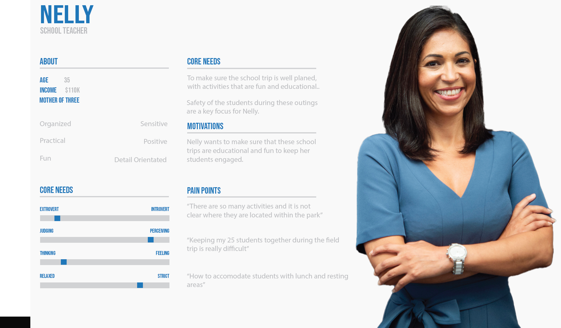
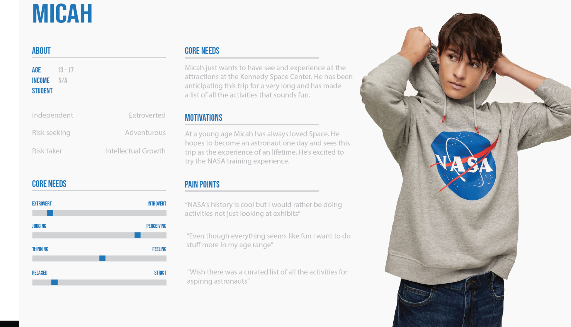
User Personas
- Nelly — A teacher planning a school visit who prioritizes logistics, cost clarity, and accessibility
- Micah — A space-enthusiast student eager to discover attractions and upcoming launches
Task & Content Analysis
Task Inventory
We documented 25+ discrete visitor tasks and scored them based on frequency and business importance to shape prioritization.
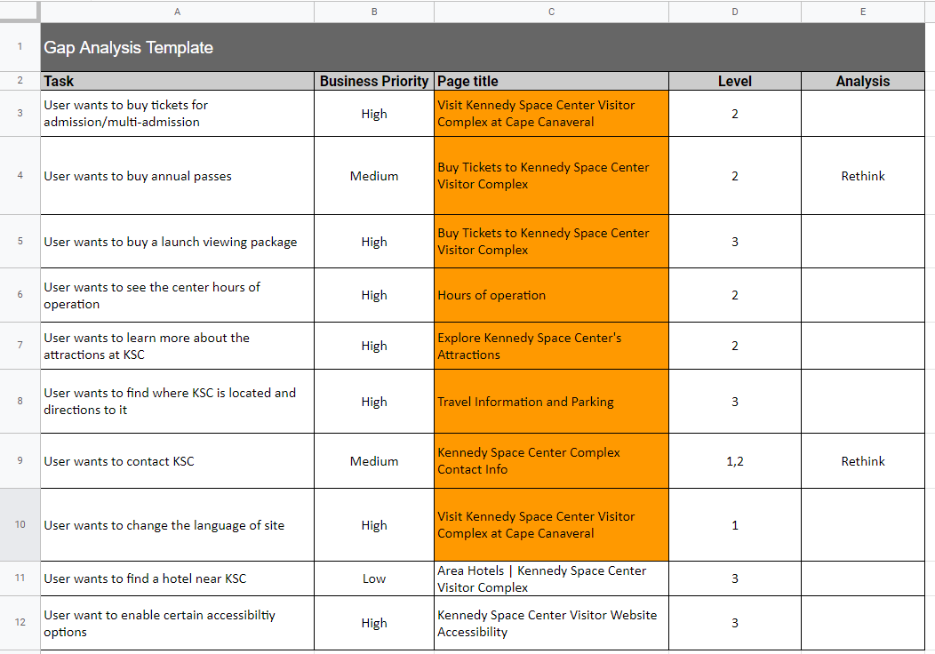
Gap Analysis
Several content gaps and pathway issues emerged:
- Support pages lacked direct links to launch schedules and group reservations
- Key content like maps and operating hours was buried several clicks deep
- There was no dedicated page explaining pass inclusions or experience levels
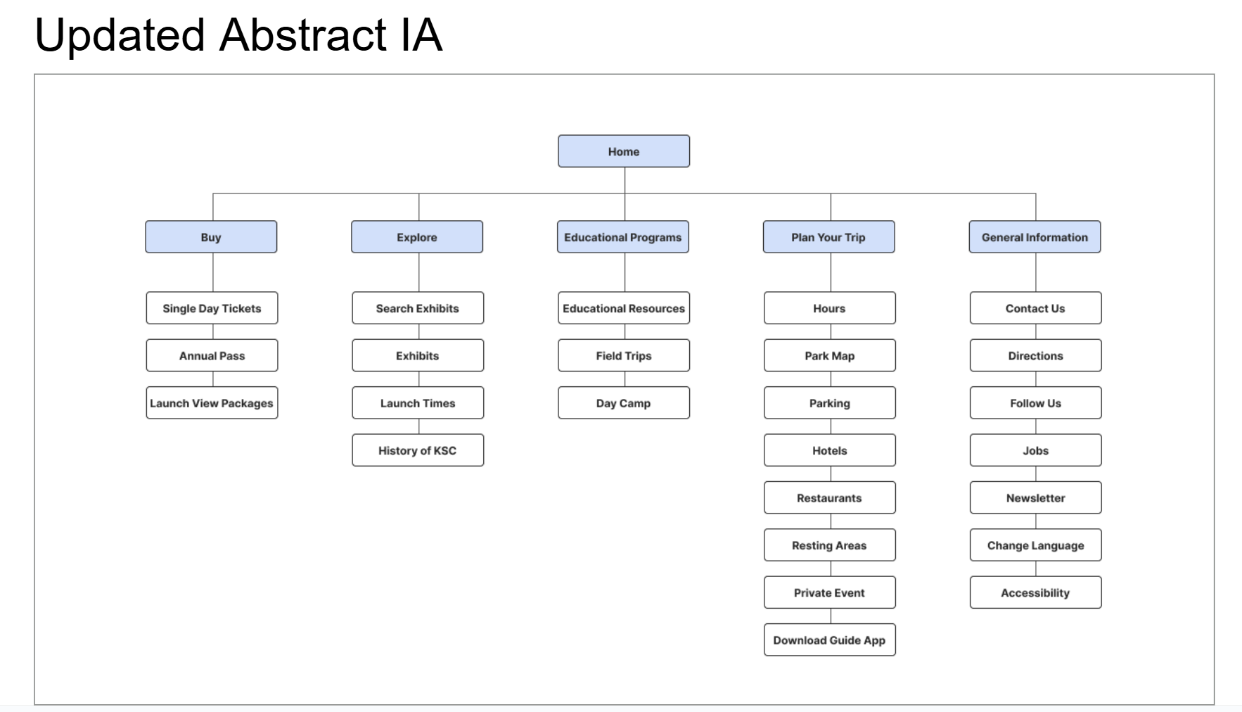
Card Sorting & Abstract IA
We conducted open and closed card sorting sessions to reveal how users naturally categorize the content. Five patterns consistently emerged:
- Plan Your Visit
- Launches & Events
- Explore Attractions
- Groups & Education
- Accessibility & Support
These groupings shaped an abstract IA that aligned with user expectations and removed redundant or confusing categories.
Tree Testing & Validation
Using Treejack, we validated our redesigned structure through scenario-based tasks.
- Find launch times
- Plan a group trip
- Locate operating hours
Results showed significant improvement:
- 88% successful task completion
- Reduced click depth across all pathways
- Higher confidence in category labeling
- Improved clarity in top-level sections
Sitemap Redesign
The final sitemap organized content into intuitive, goal-oriented categories that reduced friction and brought the most important visitor tasks within one or two clicks.
Key IA Principles Applied
Hick’s Law
Reduced top-level categories from nine to five, simplifying decision-making and reducing cognitive load.
Accessibility & Usability
Improved labeling consistency, logical grouping, and mobile-first navigation. Enhanced pathways for support, FAQs, and accessibility resources.
Final Takeaways
This project strengthened my ability to build user-centered information architecture systems grounded in research, testing, and behavioral patterns. It reinforced the value of IA as both a usability function and a storytelling tool for large digital ecosystems.
- Translate research insights into clear, intuitive structures
- Validate IA decisions through card sorting and tree testing
- Align content strategy with user goals and organizational priorities
- Design accessible pathways that support diverse visitors