Samsung Galaxy Watch4 Content Strategy Audit
Goal
Evaluate Samsung’s Galaxy Watch4 content ecosystem to identify tone inconsistencies, usability issues, accessibility gaps, and opportunities for improved content structure and search performance.
Outcome
The audit surfaced opportunities to improve search usability, strengthen messaging consistency, clarify content structure, and reinforce accessibility. Recommendations addressed predictive search, content chunking, and alignment of tone across channels.
Role
Product Analyst
Collaborated within a 4-person team where all members contributed to each phase of the audit.
I participated in the content inventory, voice and tone evaluation, accessibility review, and synthesis of key recommendations.
Course
Content Strategy – UC Berkeley Extension
Tools
Adobe Photoshop
Skills
Content Inventory, Tone & Voice Analysis, Accessibility Review, Usability Heuristics, Content Structure Evaluation
Objectives
- Inventory Watch4-related digital content
- Evaluate tone of voice and messaging alignment
- Analyze content structure and chunking patterns
- Assess accessibility and inclusive design
- Communicate findings through clear visual artifacts
Content Inventory
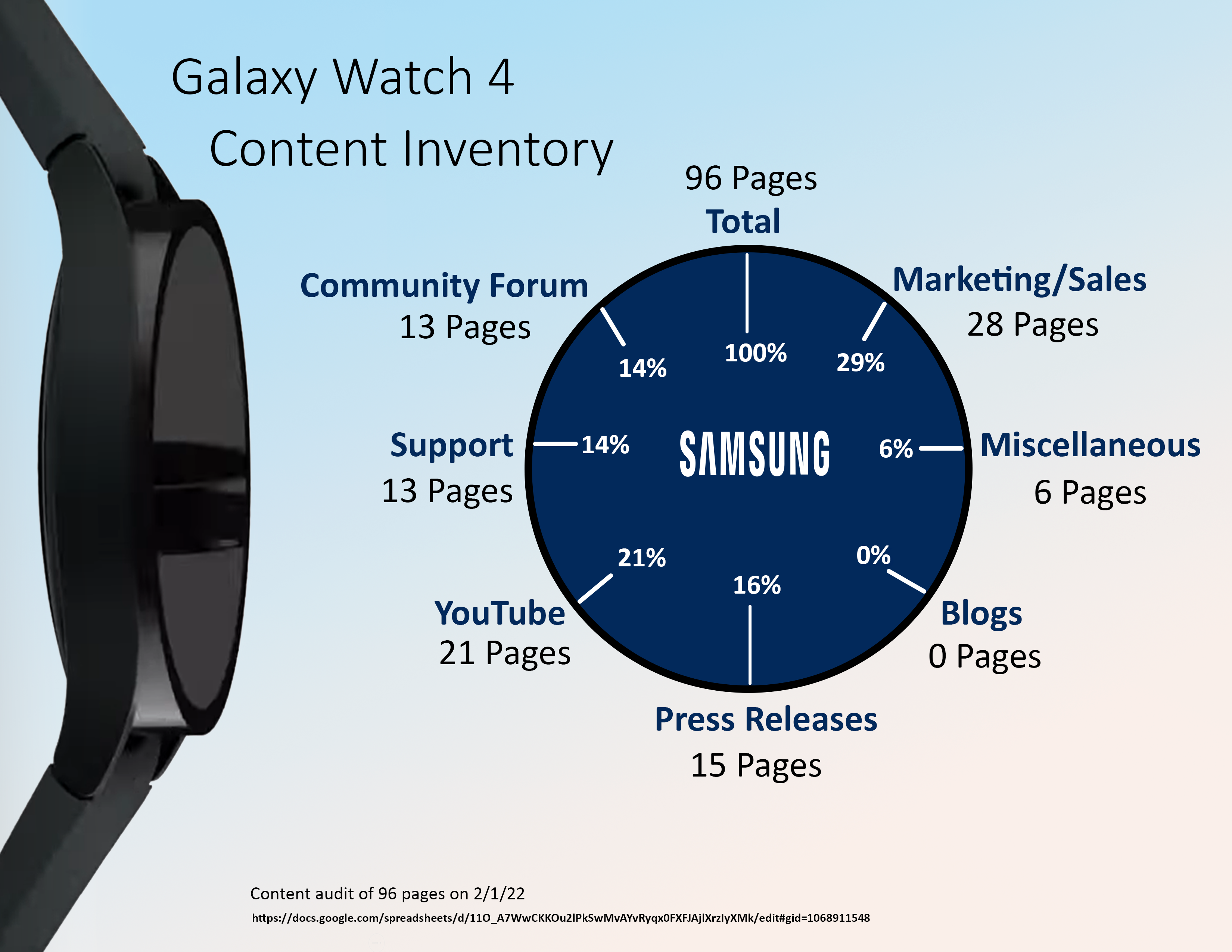
Our team documented 96 pieces of Galaxy Watch4 content across Samsung’s digital ecosystem. I focused on YouTube and miscellaneous content categories.
- Marketing/Sales: 28
- YouTube: 21
- Press Releases: 15
- Community Forum: 13
- Support: 13
- Miscellaneous: 6
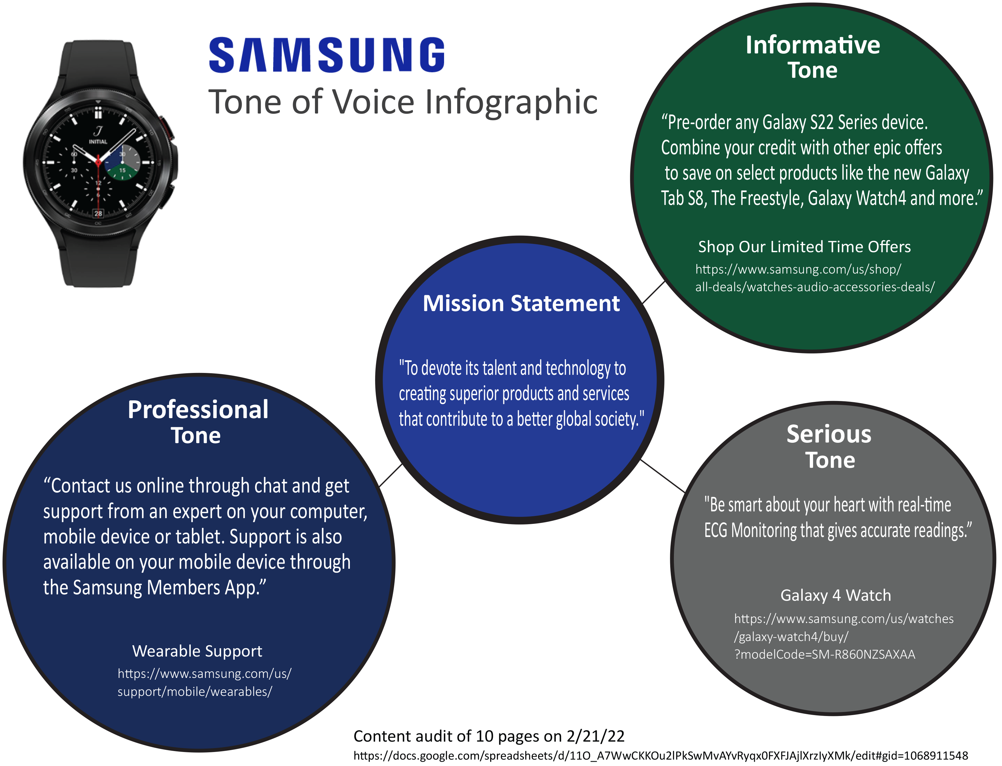
Voice & Tone Audit
Cross-channel analysis revealed three dominant voice attributes shaping the user experience:
- Professional — focused, instructional support content
- Serious — used in health and ECG messaging
- Informative — common in promotional and sales messaging
Chunking & Structural Analysis
A product detail page was analyzed to evaluate content grouping. While CTAs and comparison tools were present, many sections delivered dense information without hierarchy or progressive disclosure.
Key Findings
Search Usability Needs Improvement
The search experience varied significantly across Samsung's pages, introducing friction for users trying to locate Watch4 content:
- Search icon is hard to locate
- Search field appears only after a delayed interaction
- Search behavior is inconsistent across site areas
- Relevant Watch4 results are not prioritized
Recommendation: Implement persistent search with predictive suggestions.
Source: Nielsen Norman Group — The Magnifying-Glass Icon in Search Design
Strength: Accessibility Practices
Samsung demonstrated meaningful accessibility efforts:
- Closed captions and transcripts on videos
- Informative alt text and image descriptions
- Dedicated accessibility section referencing WCAG 2.0
- AudioEye certification enabling inclusive interaction
Final Takeaways
This project strengthened my ability to conduct structured content audits and turn qualitative findings into actionable insights. Key skills reinforced:
- Evaluating tone and messaging alignment
- Identifying usability and accessibility gaps
- Applying heuristic and content structure analysis
- Translating findings through visual storytelling